How to Improve Everyday SAP Performance with Productivity Manager
SAP was created to solve one crucial systems problem: inter-departmental communication in enterprise-level businesses. In other words, SAP centralizes important project, inventory, and fulfillment information along the full supply chain.
Without centralized communication, projects can slow or stop, mistakes are made, productivity goes down, and revenue drops because of hiccups along the fulfillment process.
That’s why SAP has over 1 million customers around the world. Businesses thrive on great communication and struggle without it.
But you don’t need to be sold the value of SAP. The system speaks for itself.
What the platform lacks, however, is a way to actively manage your people on the ground. Progress shouldn’t be slowed if a technician calls in sick or leaves work at EOD. Managers need to quickly filter orders, batch assign, and release orders in a dynamic and easy-to-use manner.
Your managers who track and monitor productivity — not just inventory or invoices — deserve a more user-friendly visual aid for their everyday work.
The Problem: The Complexity of SAP Productivity Monitoring
Consider the SAP user interface.
Columns, rows, lists, numbers — it’s akin to an old school excel document. For the right task, this setup has proven impossible to beat
Technically, SAP has the capability to manage everyday technician workflows.
But productivity tracking gets very complicated to interpret in this excel-style format, and it’s even more tricky if you need to quickly filter orders or batch edit.
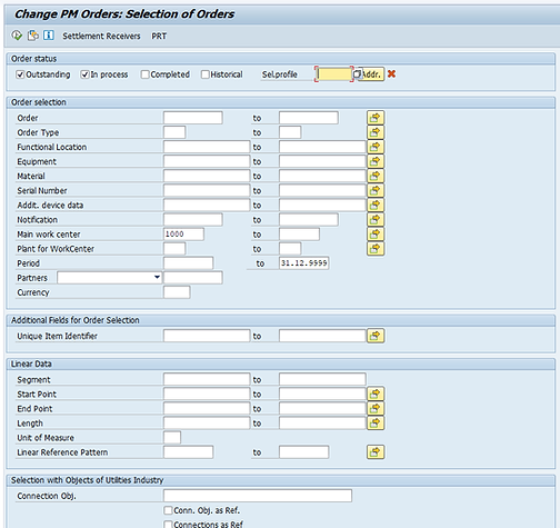
Take the image to the right, for example. Here, SAP is set up to conduct a bulk-search for work orders.
Once you click Search, you’ll receive results in the following format:
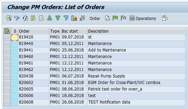
The results are a line-item list containing work orders by description. As you can see, there are requests for maintenance, updates about certain tasks, and information about testing.
There’s also a lot that’s harder to see. For example, you can’t quickly know what percentage of projects have been started versus received. The system simply provides you the raw data. Measuring general work order productivity requires the user to perform the math.
Fortunately, there’s an alternative to tracking productivity “spreadsheet-style” in SAP. This SAP add-on is called Productivity Manager.
Introducing Productivity Manager for SAP: A Streamlined Approach to Managing your Team
Productivity Manager pairs with SAP to help managers know in real time what’s happening with technicians on the job. The platform aggregates location, status, project, and technician data into simple graphics, maps, and screens to help enterprise projects move smoothly with clarity of data.
Without the combined high-level and tactical overviews available in Productivity Manager, kinks in your technician’s day-to-day processes can slow down your whole operation.
Productivity Manager helps you iron out the rough edges, resulting in a simpler, smoother workflow. It makes your job easier. It makes your technicians’ jobs easier too.
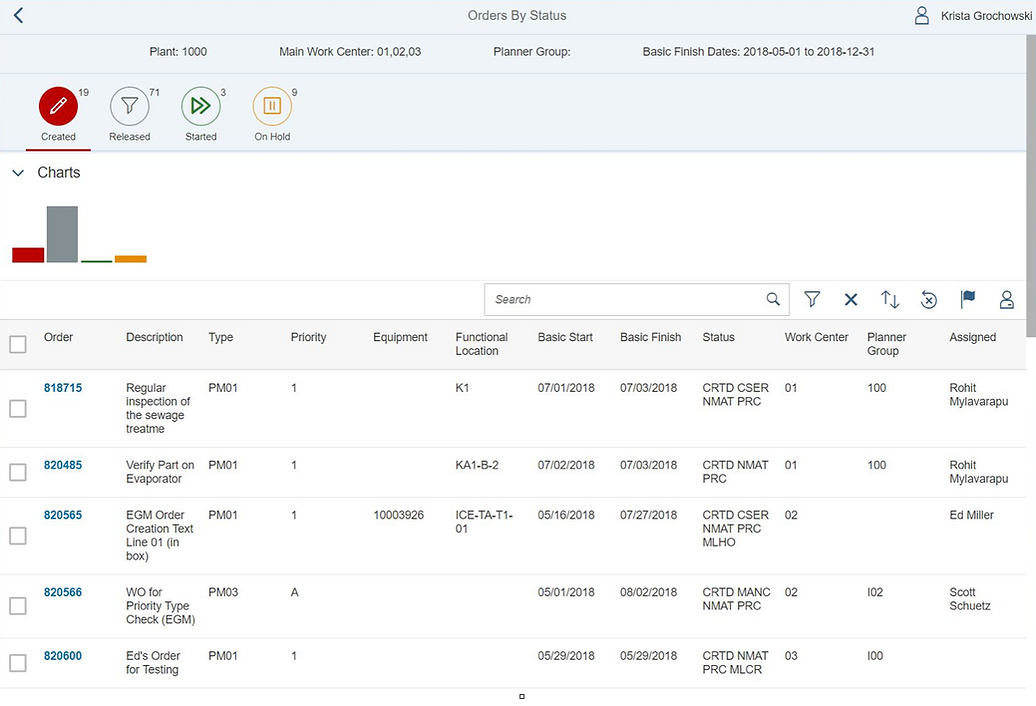
Let’s look at the same request we made earlier using SAP. This time, we’ll consider it through the Productivity Manager dashboard:
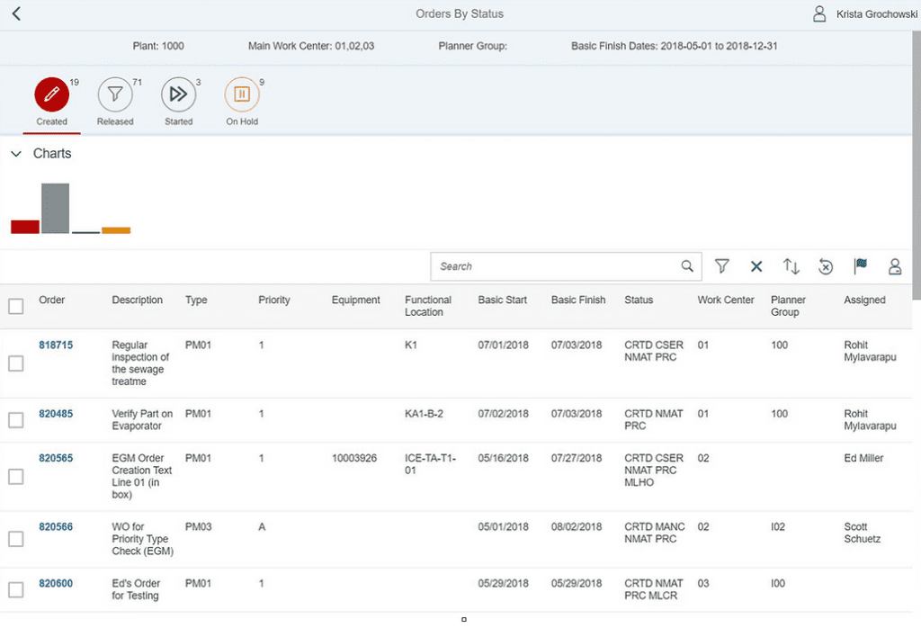
At the top of the screen, notice the four categories: Created, Released, Started, On Hold.
These categories are tabs that let you filter projects by status, making it almost unmistakable to know the progress of certain orders and jobs.
Likewise, if you clicked the Released, Started, or On Hold tabs, you’d see the projects currently under those categories.
One of the most difficult tasks for your managers was filtering or batch editing orders in SAP. Now, you can search, select, assign, and update orders in seconds.
But let’s back up.
Productivity Manager Dashboard
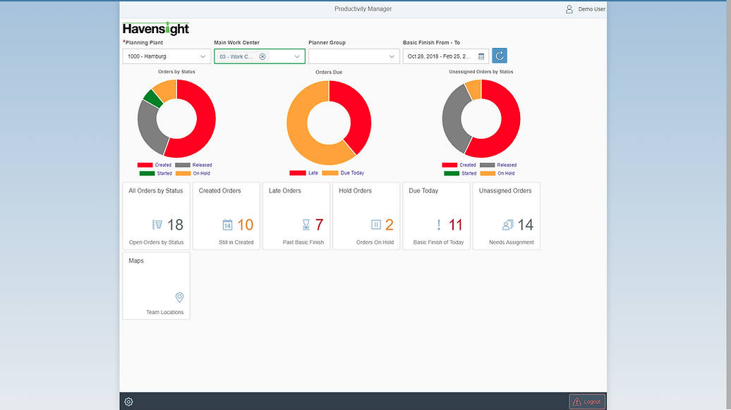
When you first login to the Productivity Manager dashboard, the software shows you a big-picture overview screen:

The doughnut charts immediately give you a visual representation of key workflow information.
With Productivity Manager, know at first glance that Red represents late work in the center doughnut chart. Unlike a spreadsheet which can require careful awareness to notice late work, the color basically jumps off the page to grab your attention.
In other words, you gain some of the most vital fulfillment information by simply logging into your dashboard.
From the overview screen, you can search and view information in finer increments. It serves as a funnel, beginning with the overarching details and spreading down into niche categories.
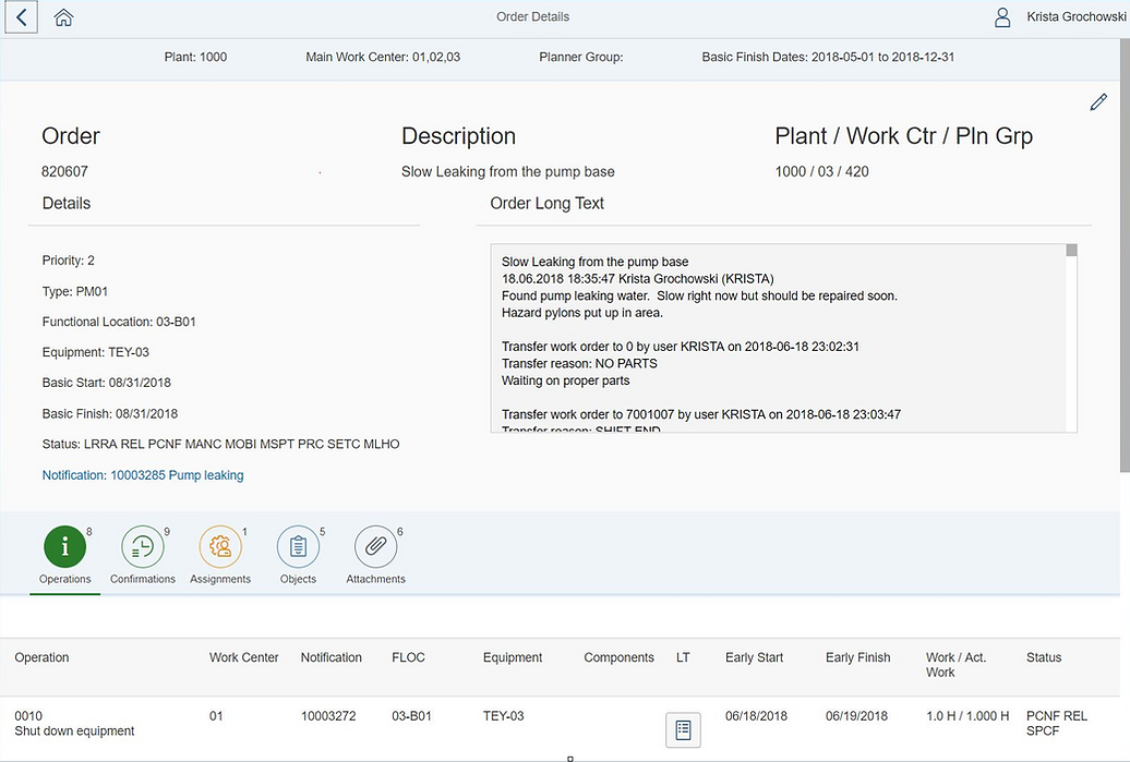
As an example, here’s what you’ll see when you click the Order Details screen:
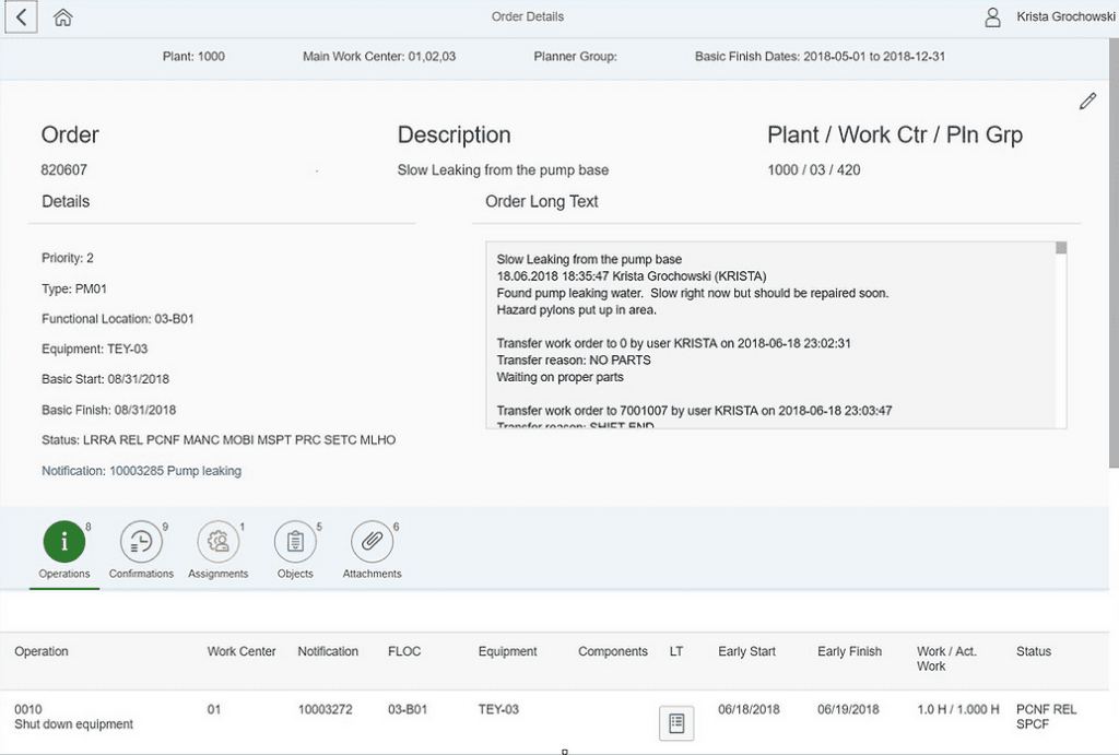
This screen provides you a clear overview of a specific project. You can see the latest updates, start and finish dates, and any notes left by the technician.
Sometimes managing a project requires granular details about the process.
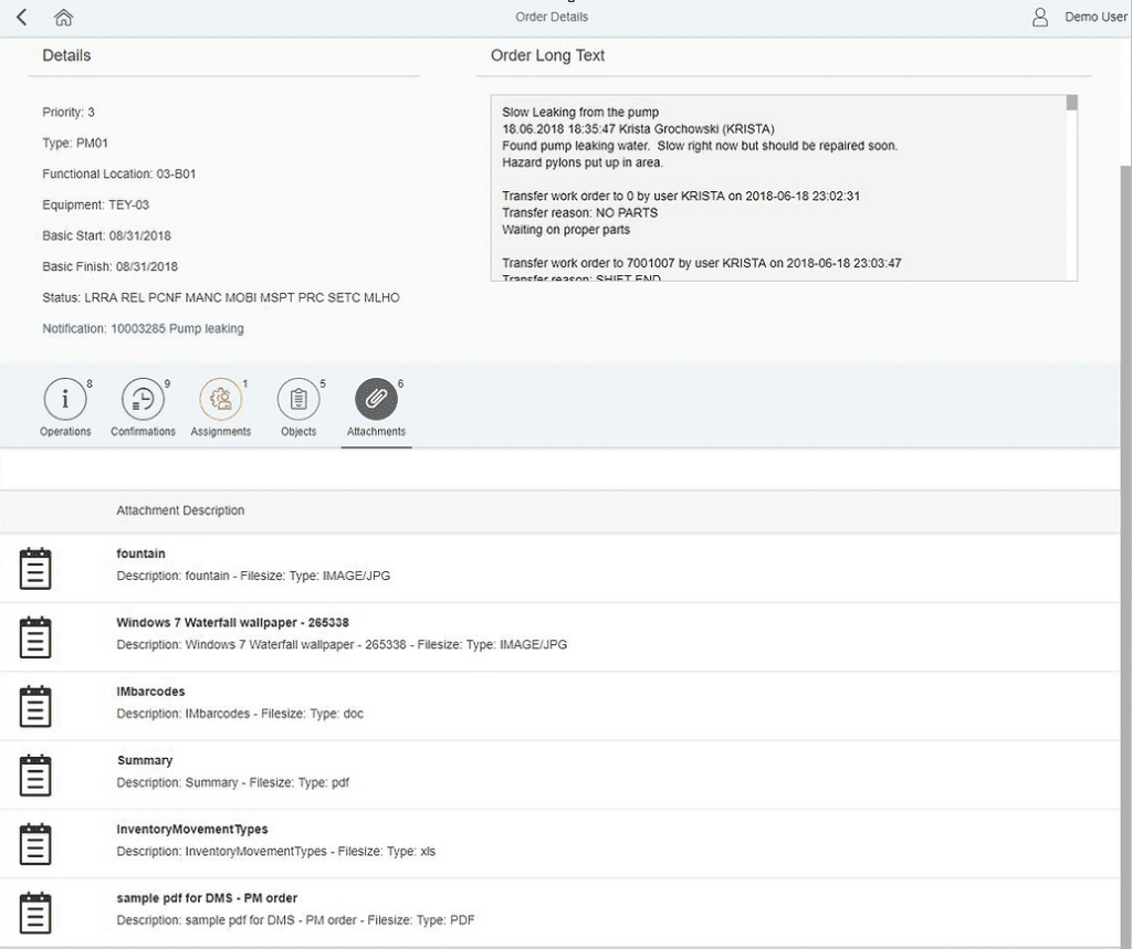
Productivity Manager also allows technicians to attach important photos or documents for others to view.
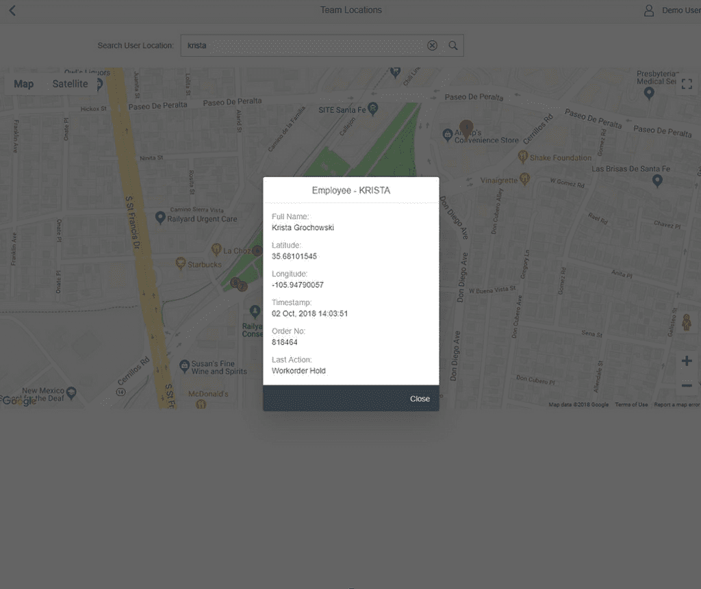
In addition, Productivity Manager offers maps in real-time with GPS-tracking. When a technician completes a certain task, they can mark their location, which is then traceable by a manager using the dashboard.
The Google Maps-style image below shows the last 15 locations pinned by the technician, giving you a full picture of where work was completed.
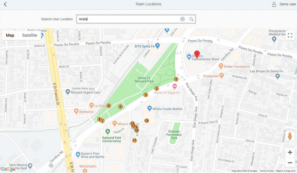
Points on a map don’t necessarily translate to substantive information on their own. That’s why Productivity Manager lets you click on each pin to learn what the technician accomplished at certain stops:
In conclusion, getting the most from SAP requires implementing visual and graphical information about ongoing projects. By monitoring projects and on-the-ground technicians through a user-friendly platform, your productivity will go up.
Good communication is critical to boosting productivity for operations at scale. Combine SAP and Productivity Manager to optimize your team workflow, decrease asset downtime, decrease repair time, and increase overall worker productivity.
Curious to learn more? Our team can help you find the right solution for your operations